About terrazzo design and color fusion
Terrazzo is a unique decorative material, whose design and palette can add beauty and individuality to indoor and outdoor spaces.
Here are some suggestions for Terrazzo design and color combination:

1.What is Single tone design?
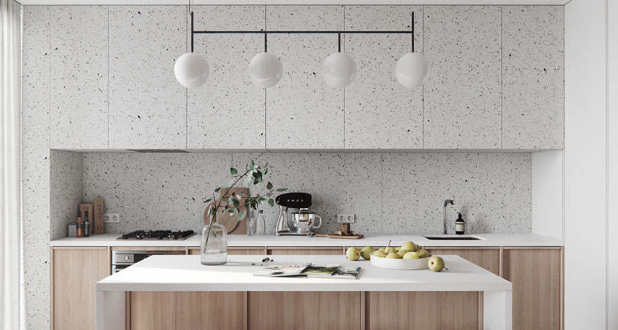
Monochrome design refers to the use of a single color or similar tone to decorate and design indoor or outdoor spaces.Select a single Terrazzo color, such as light gray or beige, and use it in the whole space. This clean and unified design is suitable for modern and Minimalism style. You can add layers with different lights and textures.
The advantages of monotonic design include:
Simplicity and unity: Monochrome design creates a unified overall visual effect, making the space look clean and orderly, reducing visual confusion.
Clear and calm: By using similar tones and monochrome design, a calm and calm atmosphere is created, which helps to relax the body and mind.
Emphasize shapes and lines: Without distracting the attention of multiple colors, monochrome design can better emphasize the shapes, lines, and textures in space, making them more prominent.
Easy to combine and coordinate: Monochrome designs are usually easier to combine with other decorative elements, as the same color or tone works well for different materials and textures.
2.What is Contrast color design?
Contrast color design can combine contrasting colors to create strong visual contrast. It enhances movement and visual impact by using complementary and contrasting colors to highlight different regions, elements, or specific accents. This design creates a strong visual contrast and movement, suitable for modern and artistic styles.
The advantages of contrasting color design include:
Strong visual effect: The combination of contrasting colors creates strong contrast between different colors, attracting people’s attention, and creating dynamic and interesting visual effects in the space.
Focus and Focus: By using contrasting colors, specific areas, elements, or details can be highlighted, making them the focus and focus in space.
Adding layers and depth: The combination of contrasting colors can add layers and depth to the space, making the distance between different regions or objects more pronounced.
Expressing emotions and personality: Different contrasting color combinations can convey different emotions and personalities.
3.What is neutral color combination?
Neutral color combination refers to the combination of neutral colors and their various tones, forming a harmonious and balanced color combination. Choose neutral Terrazzo and combine it with other neutral materials and furniture such as wood, marble, metal, etc. This combination is simple and warm, suitable for various interior design styles.
The combination of neutral colors provides great flexibility and is applicable to various interior design styles from modern Minimalism to traditional classics. Through reasonable positioning, a comfortable, warm, and peaceful spatial atmosphere can be created.
4.Natural color combination:
Choose light green, light brown, light yellow and other natural color , and combine with plants, wooden furniture and natural elements. This combination creates a natural and comfortable atmosphere, suitable for both natural and rural styles. In the combination of natural colors, you can choose according to personal preferences and space requirements.
5.What is color gradient design?
Downgrading design is a smoothly transitions colors from one tone to another. It creates a smooth, gradual, and coherent color transition effect, increasing the level of space and visual vitality. Color gradient design can also make the space more artistic and personalized. It can be used in various indoor and outdoor spaces, from walls and floors to furniture, decorations, etc.
发表回复